Using colour in your garden
Colour is an important part of any garden design. In most designs, it's the plants that provide the colour, so it's worth getting your planting scheme right from the beginning.
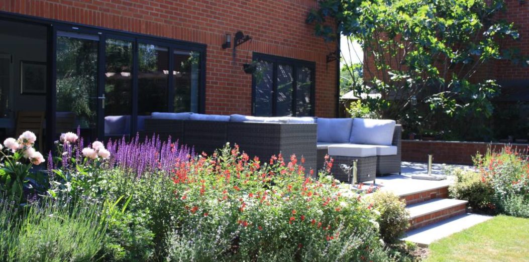
Taking time in the early stages of planning to think through your colour scheme will pay dividends later on. Not only can colour can set the mood for the garden, but it can also enhance particular areas of the design.
When choosing a colour scheme for a planting plan I begin by looking at the following:
- The style of the house
- The surrounding views
- Colours used in the hard landscaping
- The light levels in different areas of the garden throughout the day
Let’s look at the basics.
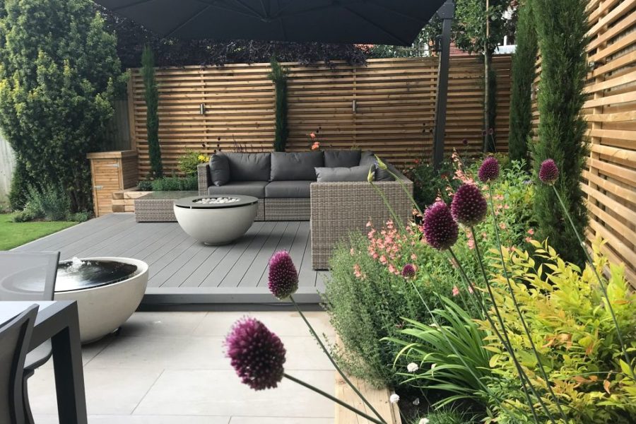
After 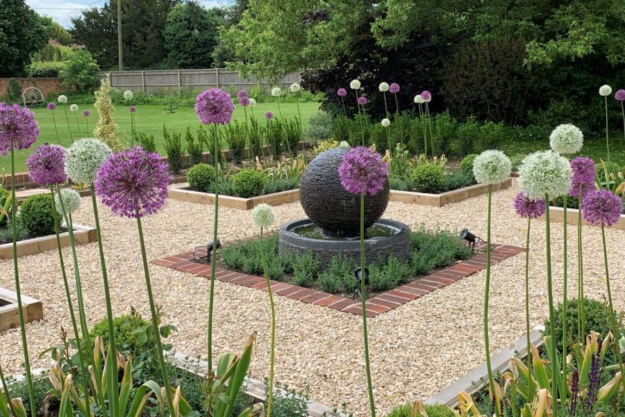
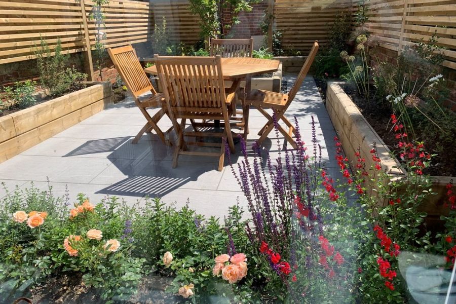
After
Neutral colours
First off, let’s think about neutral colours. These can be used with any other colour without changing the effect being created.
In planting, green is the most used neutral colour (for obvious reasons!) and it can be used to break up two colours that may otherwise clash. It also works as a backdrop to brighter colours such as red, or just to add texture amongst flowers.
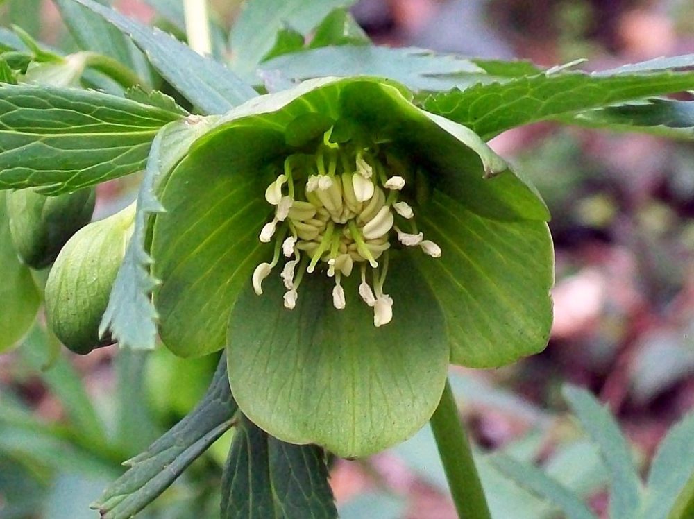
Helleborus viridis 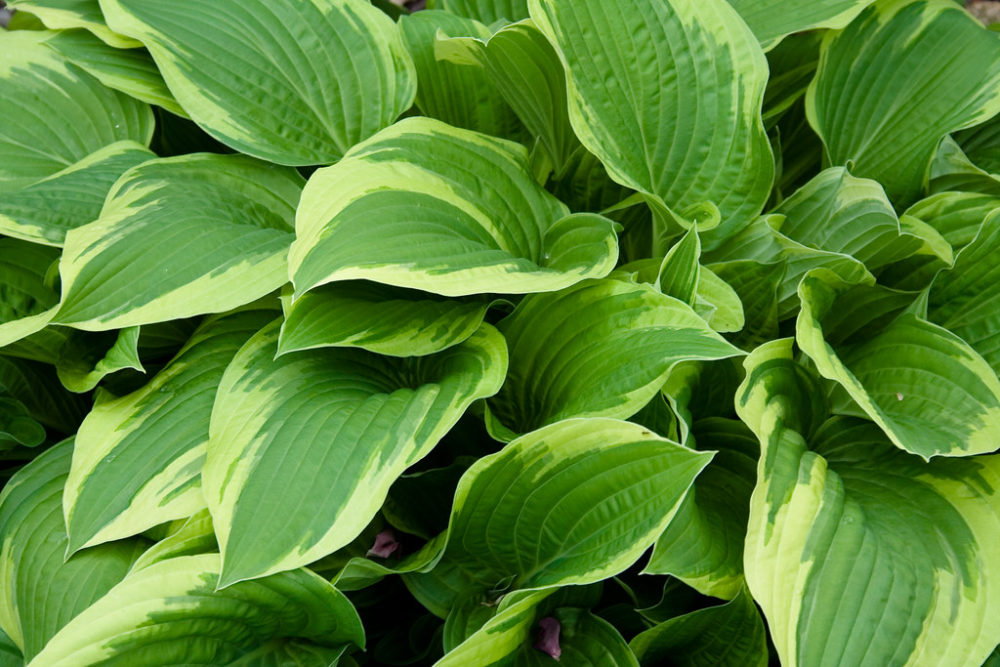
Hosta 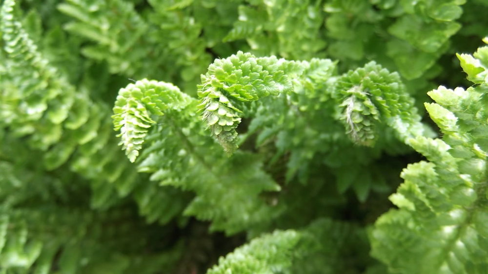
Polystichum
White is also considered a neutral colour, although in planting it has another use – it can be used as a highlight during morning or evening light. It is great for lifting an area that is in shade, so if you spend more time in the garden in the evening or you have a north facing garden white flowers and silver foliage will really shine.
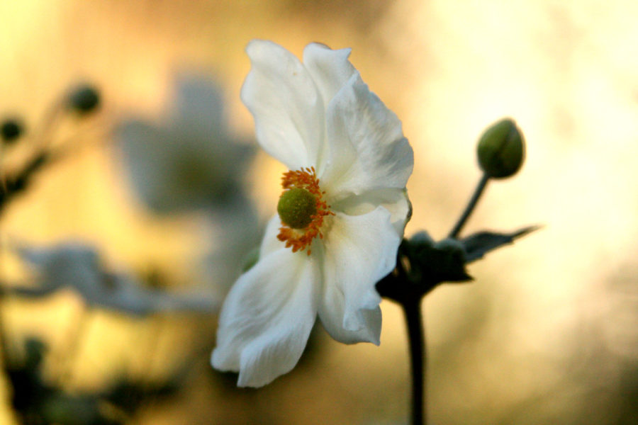
Anemone 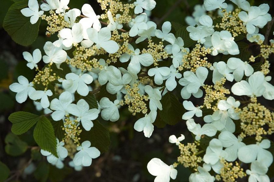
Viburnum plicatum ‘Mariesii’ 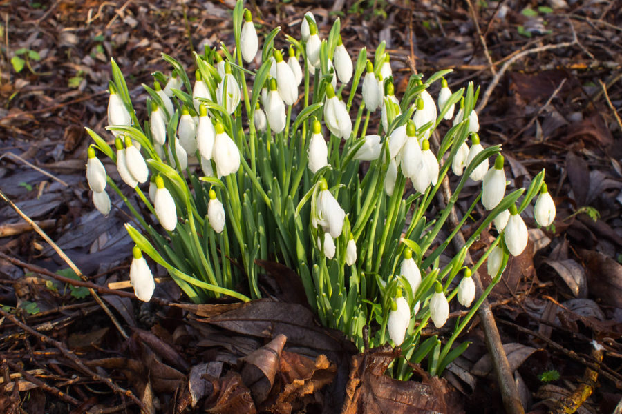
Snowdrops
The Colour Wheel
The colour wheel is a handy tool to use when planning a planting scheme. Put simply there are two sides to the wheel – warm colours (red, orange, yellow) and cool colours (pink, purple, blue).
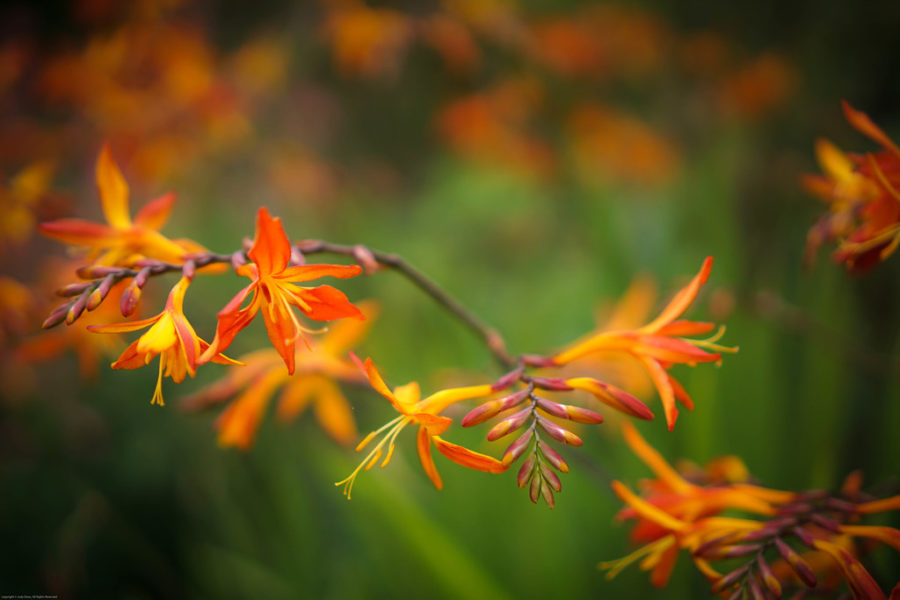
Warm colours
Warm colours create a lovely dramatic eye-catching palette to a garden. They are best used in a sunny garden, where they will really pop in full sun and can give a more enclosed feeling to a space.
Reds, oranges and yellows are bold colours and therefore also great to use as highlight planting in a mixed colour palette, particularly partnered with complimentary or opposite colours of the colour wheel.
Red and orange really stand out against a green backdrop – crocosmia against their foliage for example, or Kniphofia against an evergreen shrub. Yellow is a great partner with purple as it can highlight the purple – think about yellow Achilleas next to purple Salvias for example.
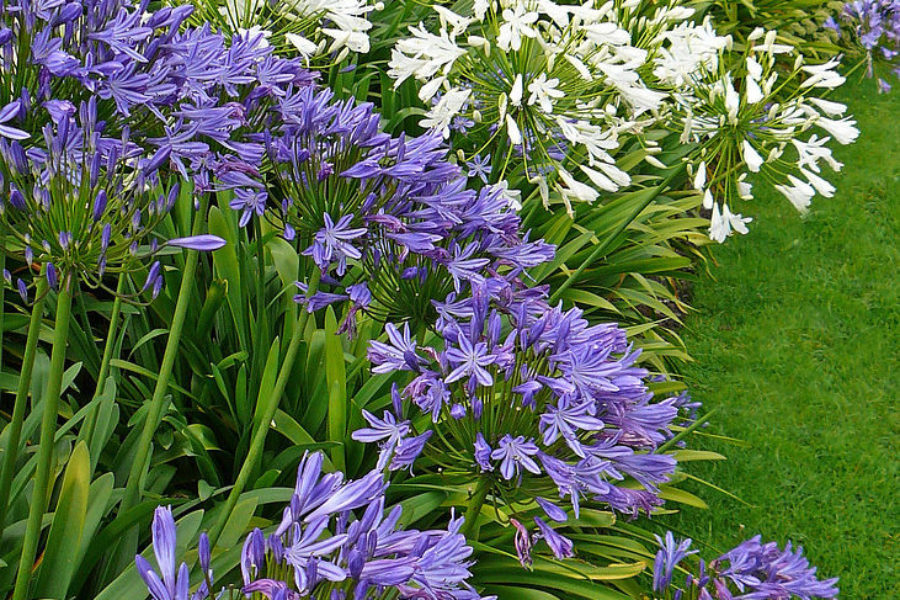
Cool Colours
Cool colours create a calming, comforting palette in a garden, receding and blurring boundaries. This makes them really useful for making a space feel bigger.
There are few true-blue flowers – most flowers described as blue are actually shades of purple. However, plants such as delphiniums, Agapanthus and blue hydrangeas at the back of borders can really add depth.
A simple palette of white and purple can bring a clean and fresh more contemporary style to a design.
Pink
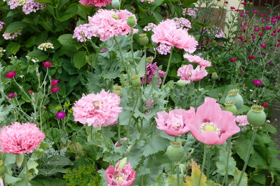
Varying shades of pink in a monochromatic border 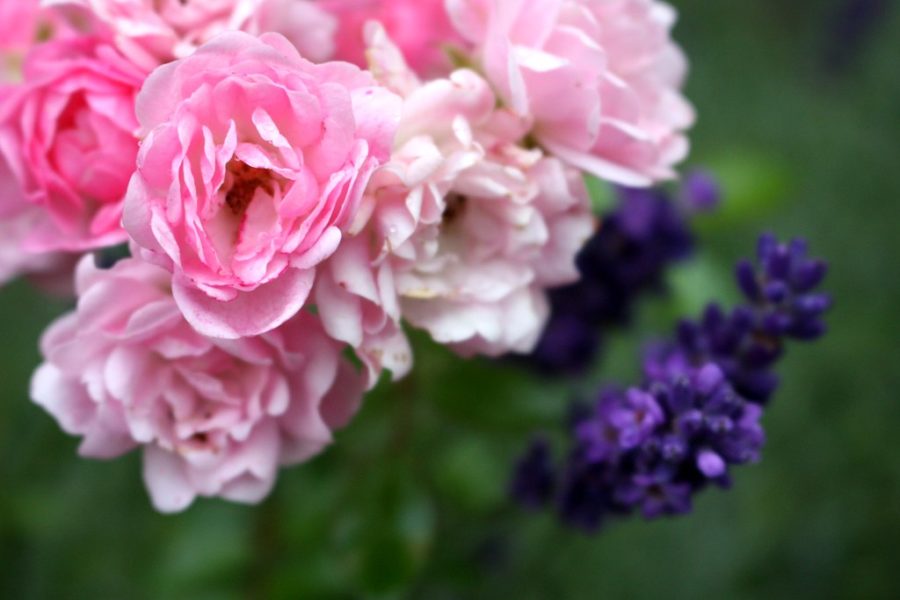
Cool: Pink roses with lavender 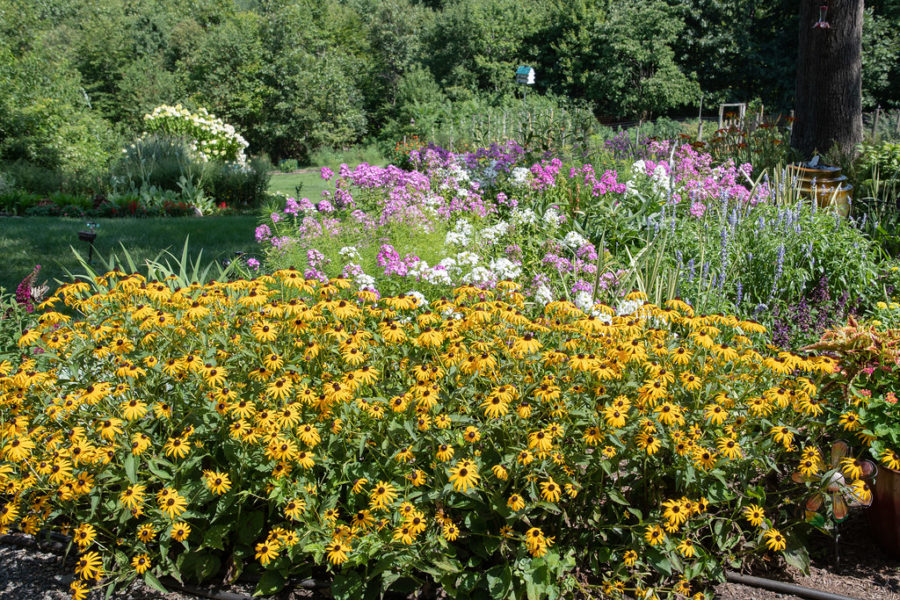
Warm: Pink Phlox with yellow Rudbeckia
I’ve included this separately, as pink is one of those colours that can be cool or warm. It offers a wide range of hues and therefore a wide range of possibilities when used in a planting scheme:
- Use it in a monochromatic way with varying shades of pink
- Combine it with other cool colours – for example, soft purples such as lavender combined with pink roses can give a romantic traditional cottage feel to a space
- Create a pop of colour in a border – bright warm tones of pinks can be combined with warmer colours – for example magenta pink Phlox combined with yellow Rudbeckia
These are just some of the basic rules when it comes to planning a planting scheme. There are many different combination options and considerations when it comes to choosing your colour scheme – which is why we always include a meeting to discuss the planting for your designs when creating your garden – it is very individual to each client and their garden.
Get in touch if you’d like to discuss your garden planting.
Photo Credits: “Green Hellebore (Helleborus viridis)” by Peter O’Connor aka anemoneprojectors is licensed under CC BY-SA 2.0; “Hostas” by kevin1024 is licensed under CC BY 2.0; “Polystichum lemmonii (Shasta Fern)” by brewbooks is licensed under CC BY-SA 2.0; “White Anemone” by cbransto is licensed under CC BY 2.0; Viburnum plicatum ‘Mariesii’; “Snowdrops” by enneafive is licensed under CC BY 2.0; “Crocosmia” by judy dean is licensed under CC BY 2.0; “Agapanthus” by Tim Green aka atoach is licensed under CC BY 2.0; “Lavender rose” by tillwe is licensed under CC BY-SA 2.0; “D75_1591-1” by Mark F. Levisay is licensed under CC BY 2.0